Project
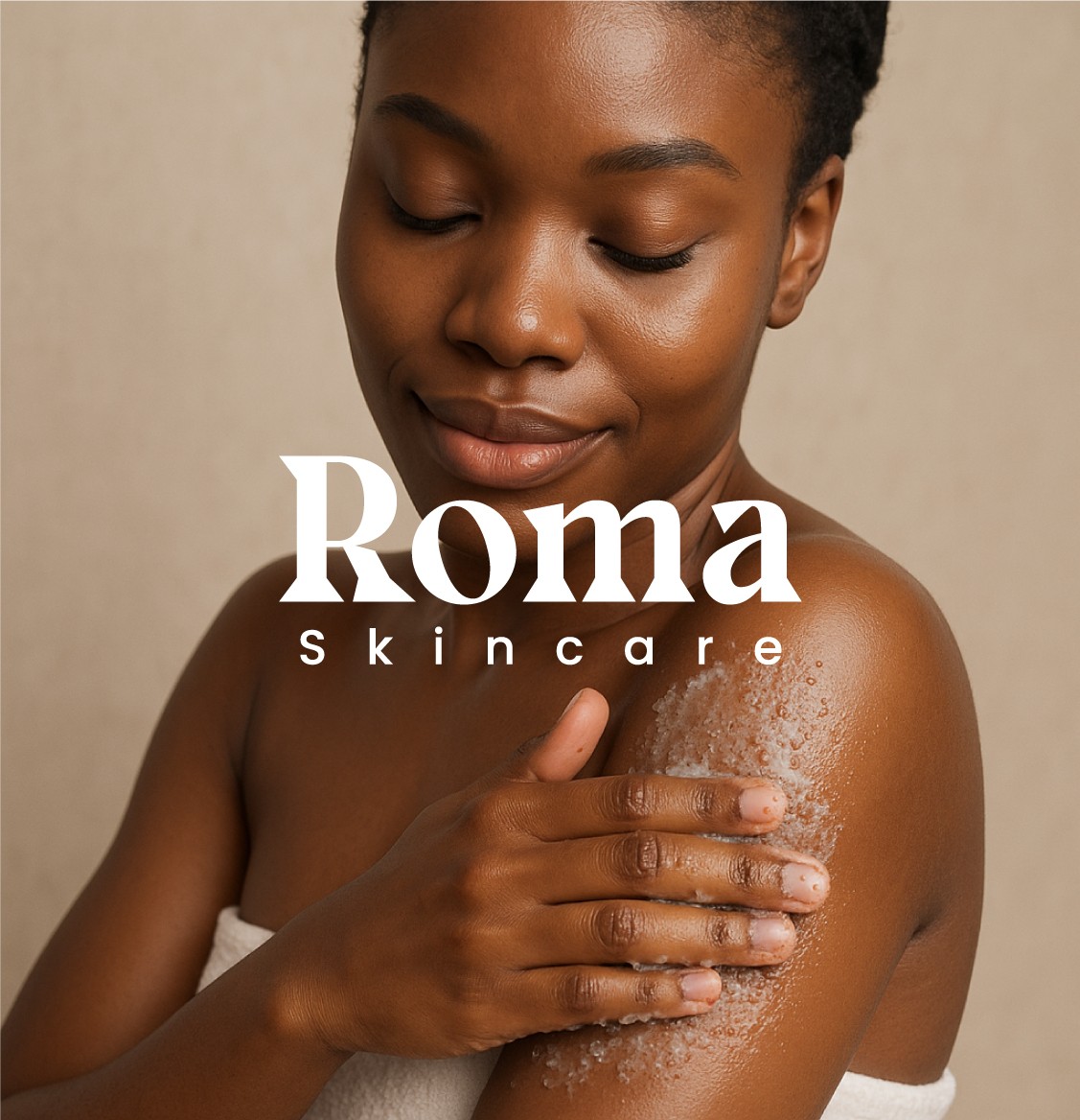
Roma - A skincare package design
Roma - A skincare package design
Year
2025
2025
Service
Packaging design
Packaging design
Roma Packaging
Roma Packaging
Project Overview
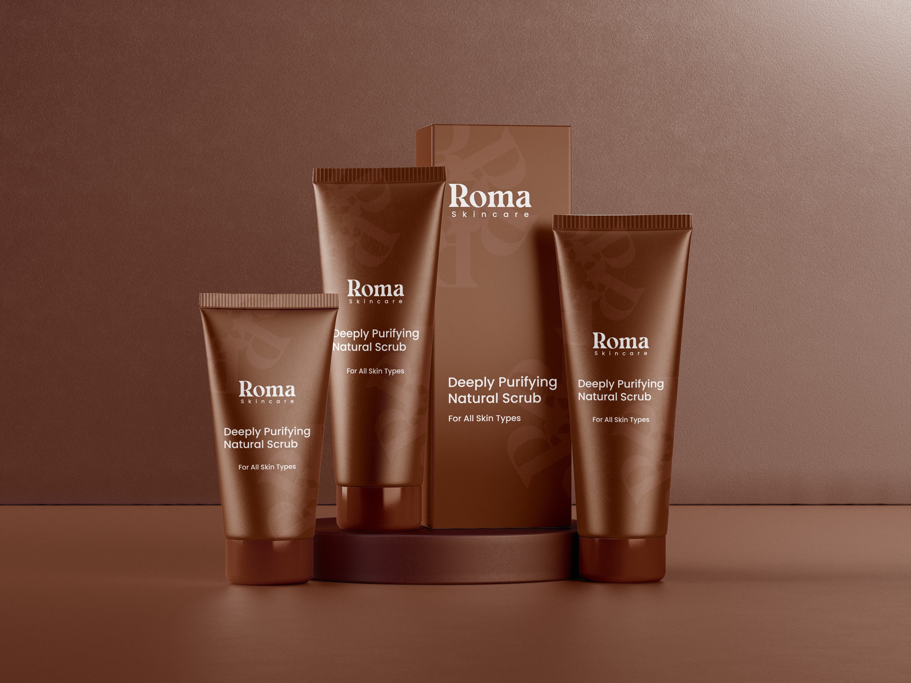
Roma Skincare, a natural skin care brand that produces body creams,body scrubs, body lotio etc required a visually appealing and consistent package design for its body scrub that will appeal to its target audience. The challenge involved creating tube packages of different sizes that is consistent with the brand, aesthetically pleasing, and appealing to the shelf.
Project Overview
Roma Skincare, a natural skin care brand that produces body creams,body scrubs, body lotio etc required a visually appealing and consistent package design for its body scrub that will appeal to its target audience. The challenge involved creating tube packages of different sizes that is consistent with the brand, aesthetically pleasing, and appealing to the shelf.
The Problem
Roma Skincare needed a packaging design that:
Aligned with its brand identity of softness, care, and elegance.
Stood out in a saturated skincare market with a consistent yet flexible look across various product sizes.
Visually communicated quality and skin sensitivity without relying on loud or overly complex graphics.
The Solution
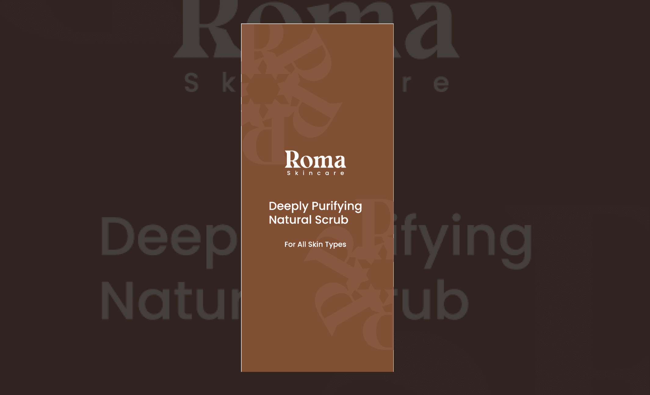
I developed a visually design system using:
A soft radial "R" pattern as a signature brand texture, adding elegance to the design.
A clean and scalable layout adaptable to different tube sizes while maintaining visual balance.
A color and typography system that emphasized softness, purity, and premium quality.
The Solution
I developed a visually design system using:
A soft radial "R" pattern as a signature brand texture, adding elegance to the design.
A clean and scalable layout adaptable to different tube sizes while maintaining visual balance.
A color and typography system that emphasized softness, purity, and premium quality.